
The boundary between fashion and interior decoration has never been so porous. The color palettes showcased on runways migrate to the paint manufacturers’ color charts, and the textures of textile collections inspire the choice of wall coverings. Stylistic movements like quiet luxury redefine how we furnish a living room or bedroom.
Understanding this transfer mechanism between wardrobe and living space allows for more coherent and sustainable decoration choices.
Further reading : How to Save on Your Trips to the Caribbean?
Quiet luxury in decoration: from wardrobe to living room
Quiet luxury refers, in fashion, to an approach that prioritizes the quality of materials and the subtlety of cuts over visible logos. Applied to interior decor, this principle translates into a few carefully selected pieces known for their craftsmanship and durability.
In practical terms, this means replacing an accumulation of decorative objects with a few high-value items: a thick wool throw draped over a sofa with clean lines, a raw stoneware vase on a solid wood console. The effect relies on the material, not on the quantity.
See also : The best solutions to enhance the comfort and safety of your home
This trend is described by lifestyle media as a direct response to fast fashion and overconsumption. In decoration, it encourages investment in furniture designed to last through the years rather than following every seasonal micro-trend. To spot the pieces and collections that embody this approach, one can visit the site maisondemode.fr and compare the offered universes.
Trendy color palettes: what runways send to interiors
The colors adopted in decoration do not emerge in a vacuum. They follow a cycle that often starts on the catwalks, passes through textile trend offices, and then reaches paint and furniture catalogs with a delay of a few seasons.
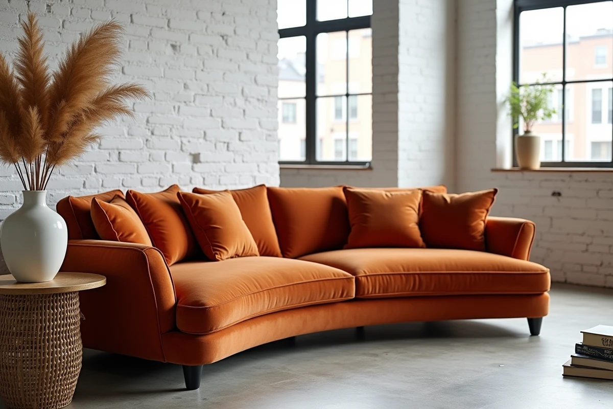
For the recent period, the shades highlighted by interior design experts share a common trait: they are desaturated and calming. Specialized analyses notably cite eucalyptus and forest greens, hemp beiges, misty blues, softened terracotta, and cacao or caramel tones.
These palettes are explicitly presented as responses to ambient stress and socio-economic uncertainty, a driver rarely mentioned in mainstream decoration guides. The color of a wall or a bed textile is not just an aesthetic choice: it is a sensory lever that influences the atmosphere of a room on a daily basis.
Applying a palette without monotony
Adopting muted colors does not mean creating a bland interior. The principle is to work with variations of similar tones rather than through harsh contrasts. A living room can combine a forest green wall, a hemp beige sofa, and terracotta cushions without the overall look appearing uniform.
- Choose a dominant color for large surfaces (walls, floor, sofa) and limit accent shades to a maximum of two to maintain visual coherence in each room.
- Play with textures rather than bright colors: a crumpled linen, a corduroy velvet, and a brushed cotton in the same beige range create a rich effect without overload.
- Test the color in the natural light of the relevant room, as an eucalyptus green may turn gray in a north-facing bedroom.

Biophilic design: when nature structures interior layout
Biophilic design goes beyond simply placing a green plant on a shelf. Recent analyses present it as a structuring pillar of layout, a philosophy that integrates a connection to living things into every decoration decision.
This involves concrete choices: favoring curved lines inspired by the organic world in furniture, maximizing natural light, introducing sensory materials (raw wood, stone, plant fibers), and integrating large-scale vegetation. XXL plants or indoor trees become full architectural elements, not just simple accessories.
Biophilia and fashion: a common language
The link with fashion exists here as well. Recent textile collections exploit the same natural codes: botanical prints, plant-based dyes, unprocessed fibers. Translating this vocabulary into decor means choosing objects and textiles whose manufacturing and appearance evoke the living rather than the synthetic.
An unbleached linen curtain, a low table with visible wood grains, or a hand-woven jute rug contribute to this logic. The goal is not to reproduce a trend catalog, but to build an interior where each piece contributes to a sense of calm and sensory connection.
Method for spotting translatable fashion trends in decor
Not all fashion trends lend themselves to translation into decoration. Some are too ephemeral or too body-related to function in a space. The selection is based on a few simple criteria.
- Check the longevity of the movement: a fashion trend present for at least two consecutive seasons is more likely to establish itself sustainably in decor than a buzz effect limited to a runway show.
- Identify the underlying principle rather than the form: quiet luxury is not translated by clothes hanging on the wall, but by the principle of qualitative sobriety applied to furniture selection.
- Observe materials before patterns: a textile that works on a garment often works as a cushion cover or bed throw, provided the weight is adapted.
- Cross-reference sources: when the same movement appears simultaneously in fashion magazines, decorators’ accounts, and catalogs of major home brands, the convergence is a reliable signal.
The convergence between fashion and interior decoration relies on concrete mechanisms of transfer of colors, materials, and stylistic philosophies. Each design choice, from the color of a wall to the fabric of a cushion, benefits from being evaluated from this perspective to create an interior that is both current and personal.